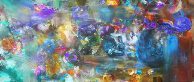
[I don't know. I'm still reworking this piece. Something that makes a varied/interesting hybrid of the old and new version may be preferable. 01/18/2017 09:18:15 PM]

Image links to larger image, free for personal use. This work was previously titled Abstraction [twenty-two.] The brackets and spelled instead of numeric why? It's technical.
Software used: SolidWorks, 3ds Max, Photoshop, Painter, pixeur, irfanview, LibreOffice calc. How this was produced:
- Targeted a desired print size @ 300dpi using my target resolution calculator spreadsheet
- Made a few abstract shapes in SolidWorks
- Imported them into 3ds Max (you have to use the 32-bit version of at least max 2013 with the import file open in SolidWorks to do this)
- Collapsed them to editable polys, and with SoulBurn scripts, painted them over a terrain with random scale and orientation, and applied random material IDs between 1-100
- Applyied a custom multi-sub material with a hundred different fractal flame/winamp milkdrop textures that apply by randomized material id (embedded yet further in a composite material with an alpha/edge blend mask)
- Rendered a gray under-painting and several layers of randomized material color over-paintings
- Mucked around with those in so many different layers with color cloning palette knives and oil paint in Painter, and auto-cloning, erasing, blending in various layer modes, etc.
- Mucked around with all those so many times in Photoshop
- Mucked around with those in turn so many times in Painter
I wasn't pleased to revisit this work, and reworked it. The previous version:

I like the colors, texture, smears and general forms of this original better than my revised version, but I prefer clarity of form (even for something semi-abstract) over that. The original was so indistinctly formed as to be a pretty blur, which would better be incorporated as part of some other work.
I think I'd like even better something that harmonizes or interestingly combines the two. I may yet make a third revision.
