[UPDATE: there's a lot more to light and color science than I perhaps inaccurately get at in this post. Also, try color transforms and comparisons (if the latter is possible?) in Oklab.]
It turns out that all of the digital color models in wide use are often bad for figuring out which of any two colors are "nearest," according to humans.
Sometime in my web meanderings, I stumbled on information about the CIECAM02 color model (and space), including a Python library that uses it and a (gee-wow astonishing at what it can do with color) free Photoshop-compatible plugin that manipulates images in that space. [EDIT 2020-10-07: link to that plugin down and I can't find the plugin on the open web anymore. Here's a link to my own copy of it (in a .zip archive)] If you do color adjustments on images using an application that's compatible with Photoshop plugins (a lot of programs are), go get and install that plugin now! Also: a CIECAM02 color space browser app (alas, Windows only it seems?).
I wrote a Python script that uses that library to sort any list of RGB colors (expressed in hex) so that every color has the colors most similar to it next to it. (Figuring out an algorithm that does this broke my brain–I guess in a good way.) (I also wrote a bash script that runs it against all .hexplt files (a palette file format which is one RGB hex color per line) in a directory.)
The results are better than any other color sorting I've found, possibly better than what very perceptive humans could accomplish with complicated arrays of color.
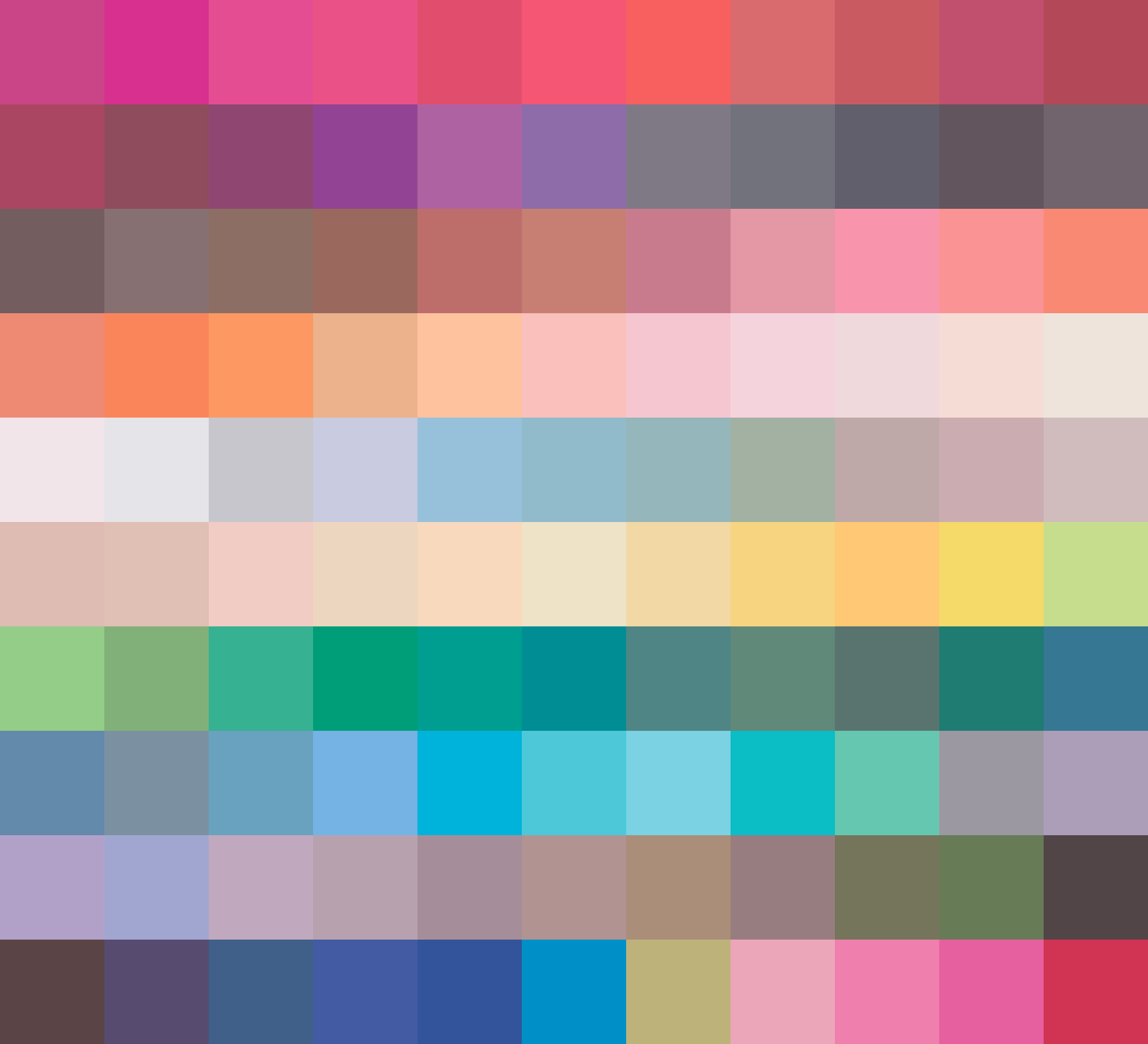
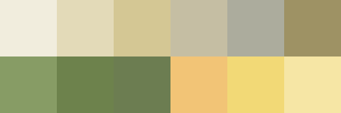
Here's an image of Prismacolor marker colors, in the order that results from sorting by this script (the order is left to right, top to bottom) :
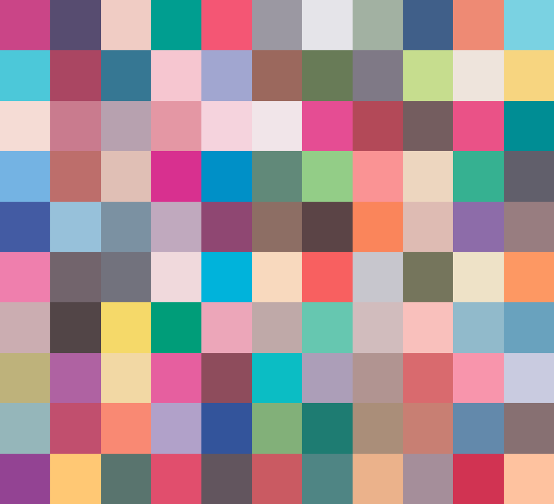
For before/after comparison, here is an image from the same palette, but randomly sorted; the script can turn this ordering of the palette into the above much more contiguous-appearing:
(It's astonishing, but it seems like any color in that palette looks good with any other color in it, despite that the palette comprises every basic hue, and many grays and some browns. They know what they are doing at Prismacolor. I got this palette from my cousin Daniel Bartholomew, who uses those colors in his art, which you may see over here and here.)
Some other palettes which I updated by sorting them with this script are on display in my GitHub repo of collected color palettes.
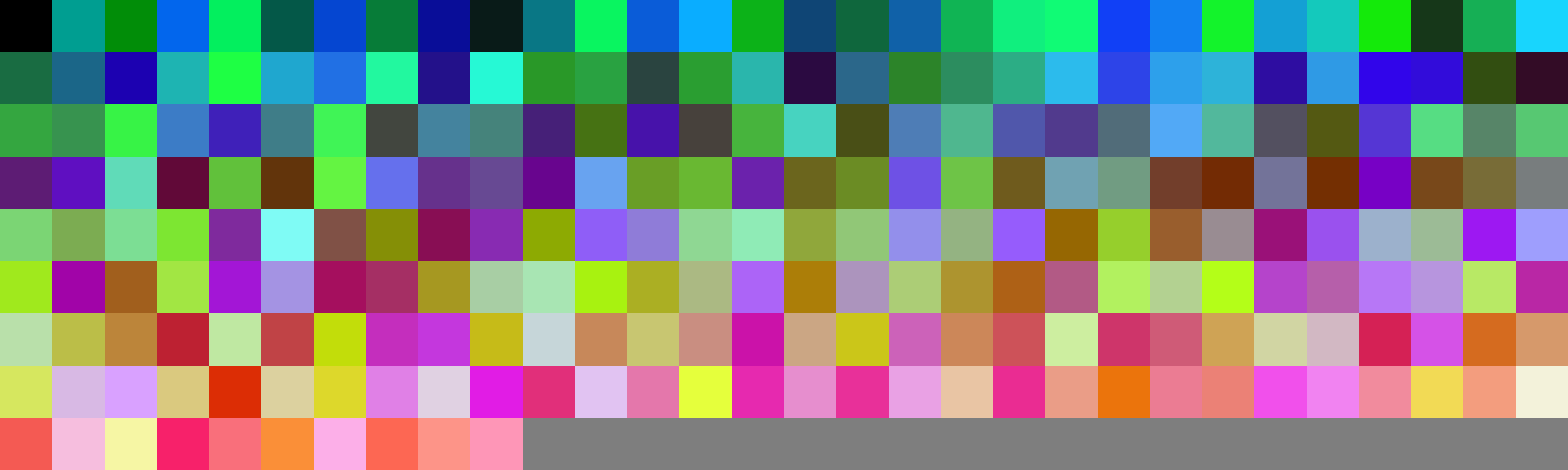
Here is another before and after comparison of 250 randomly generated RGB colors sorted by this script. You might correctly guess from this that random color generation in the RGB space often produces garish color arrays. I wonder whether random color generation somehow done in a model more aligned with human perception (like CIECAM02) would produce more pleasing results.
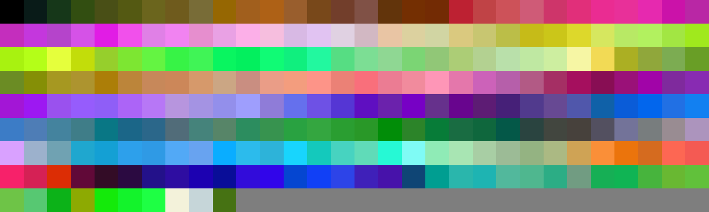
See how it has impressive runs of colors very near each other, including by tint or shade, and good compromises when colors aren't near, with colors that are perceptually further from everything at the end. Also notice that darker and lighter shades of the same hue tend to go in separate lighter/darker runs–with colors that well interpolate into those runs in between!–instead of having lights and darks in the same run, where the higher difference of tint/shade would introduce a discontiguous aspect.
Tangent: in RGB space, I tested a theory that a collection of colors which add (or subtract!) to gray will generally be a pleasing combination of colors–and found this to be often true. I would like to test this theory in the CIECAM02 color space. I'd also like to test the theory that colors randomly generated in the CIECAM02 space will generally be more pleasing alone and together (regardless of whether they were conceived as combining to form gray).
I really can't have those as the last images in this post. Here is a favorite palette.
Here's the URL to that palette (in my palette repository).
[Edit 2020-10-07: I had renamed or moved several things I linked to from this post, which broke links. I corrected the links after a reader kindly requested to know where things had gone.]